DESIGN TO WEB
Technical Blog
06.MAR.2016
What a responsive site is, and why responsiveness is important?
A responsive site is a site that rescales and changes it's size and styling to fit the visitors screen size. As mention in one of my earlier Technical blog post HTML-CSS-DOM Part 2, "Because we are living in a time where more people are accessing the web with mobile devices and tablets. Having a responsive site that changes and adapts to the users screen resolution is a must for any web developer."
What mobile first design is, and why it's important?
Mobile first design is when a site is built in a way that focuses first on code and design that works best with mobile devices. This is done by writing your code first for mobile devices. By doing this it can improve your sites performance when accessed on mobile devices. To make your site responsive for larger screen sizes we use "media queries". Media queries allow you to write extra code for larger screen sizes e.g. tablets, laptops, desktops and HD desktops. By using media queries we can make the site use different bits of code for different screen sizes. If done right it can make for a better user experience on your site.
What frameworks are and their pros and cons?
A css framework is a default set of css and html files that provide a good foundation of code to build on. Because css frameworks usual include things like grids, buttons, forms, typography and common layouts can save developers a lot of time because they don’t need to write everything from scratch. Nowadays there are plenty of free frameworks for people to choose from. For example we used the Skeleton framework that’s based on mobile first design.
Pros - As mentioned above using frameworks can make building your site or project much easier and faster to work on. Another positive is that it also encourages you to use certain semantic, design and layout practices, which I imagine would be highly beneficial when working on a project with a team or doing further development later down the track.
Cons - Based on my experience with Skeleton, I found using the framework to be quite limited and forced me to change how I had positioned items and wrote my code altogether before hand.
Overall I look forward to learning more about the use of CSS frameworks on personal and team projects.
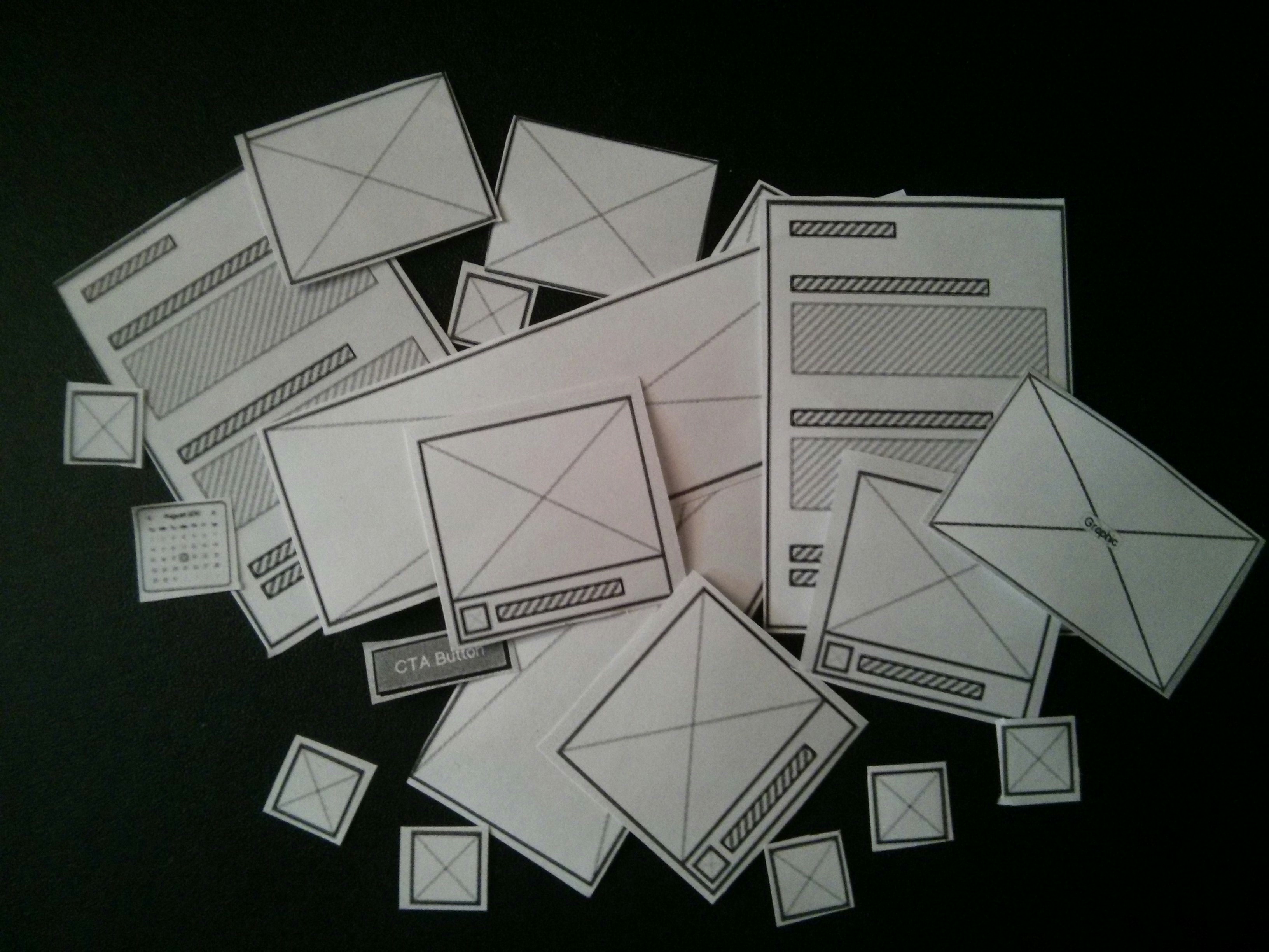
What a wireframe is and why we use it?
A wireframe is a basic blueprint of your site design. It helps you to structure the layout of the html elements inside your code it is also a great reference resource during the styling and layout process of your site development.


The aspects of your wireframes you found difficult to implement, and why
The most difficult thing I found was sticking to my wireframe design all together. I keep changing my mind about what I wanted. I'm such a fusy person when it comes to how things look... my visual design skills or a lack of them are definitely work in progress. If I was to single out one aspect that frustrated me the most was definitely trying to implement the 'selection-list' feature from this Zen Garden example. The hardest part was trying to center the list on the page, with the '......' content fading behind the 'date' on the right side of the list.